🔥 Best Instagram Fonts for 2026 That Actually Get Attention
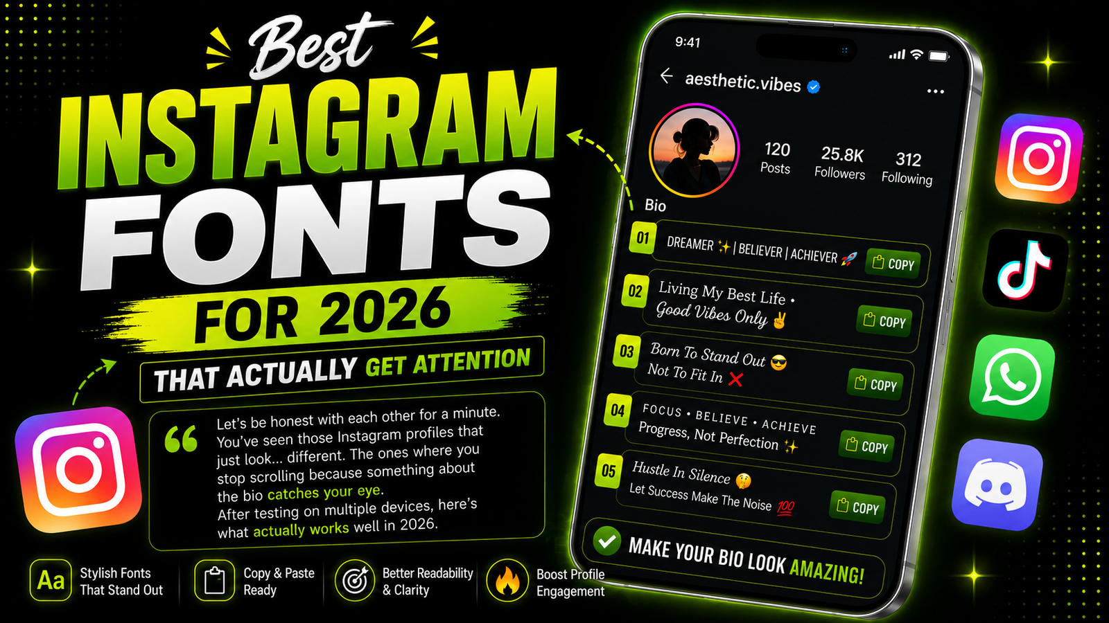
Let's be honest with each other for a minute. You've seen those Instagram profiles that just look... different. The ones where you stop scrolling because something about the bio catches your eye. Nine times out of ten, it's because they're using a font that stands out from the crowd. I've spent way too many hours testing different fonts for Instagram bios, and honestly? Some look amazing on a computer screen but terrible on a phone. After testing on multiple devices and asking friends for feedback, here's my honest list of what actually works well in 2026.
The thing about Instagram is that people scroll really fast. Like, really, really fast. Studies show that the average user spends less than two seconds looking at a profile before deciding whether to follow or keep scrolling. That means your bio needs to grab attention immediately. A plain text bio in the default Instagram font blends in with everyone else. But a bio with a stylish font? That stands out immediately and makes people stop and actually read what you've written.
1. The Bold Script Font
You know the one I'm talking about. It looks like someone took a fancy pen and wrote it by hand. This font works really well for usernames and short bios because it's elegant but still readable.
Example: 𝓙𝓮𝓼𝓼𝓲𝓬𝓪'𝓼 𝓣𝓻𝓪𝓿𝓮𝓵 𝓓𝓲𝓪𝓻𝔂
It adds a personal touch without being hard to figure out. I've seen travel bloggers, food accounts, and lifestyle influencers use this font successfully. It gives off a sophisticated but friendly vibe that works across many different niches.
2. The Bubble Text Font
This one is huge with younger audiences right now. It's playful, it's fun, and it works perfectly for lifestyle bloggers, food accounts, and anyone who wants to seem approachable.
Example: Ⓣⓗⓔ Ⓒⓞⓩⓨ Ⓒⓐⓕⓔ
People actually stop and read this because it's different from what they normally see. The bubble text font works especially well for accounts that focus on fun, lighthearted content. If your brand is playful and energetic, this might be the perfect choice for you.
3. The Double Struck Font
If you want to look professional but still interesting, this is your best option. Musicians, artists, photographers, and small business owners love this one.
Example: 𝕋𝕙𝕖 𝕆𝕗𝕗𝕚𝕔𝕚𝕒𝕝 𝔸𝕣𝕥 ℙ𝕒𝕘𝕖
It's bold, it's clean, and it works across all devices. The double struck font has a mathematical, precise feel to it. It suggests that you mean business but you also have style. I've recommended this font to several small business owners, and they've all been happy with the results.
4. The Star Decorated Font
Okay, this one is everywhere on TikTok right now. People are adding stars before and after their names or taglines.
Example: ✨ 𝙹𝚞𝚜𝚝 𝙰 𝙶𝚒𝚛𝚕 𝚆𝚒𝚝𝚑 𝙳𝚛𝚎𝚊𝚖𝚜 ✨
Simple but really effective at drawing attention. The star decoration adds a little sparkle without being overwhelming. It's like adding a tiny bit of glitter to your bio. It catches the eye but doesn't distract from the actual words.
5. The Monospace Font
This looks like old typewriter text. It's giving vintage vibes and works great for bookstagram accounts, writers, poets, and anyone with a nostalgic aesthetic.
Example: 𝚆𝚘𝚛𝚍𝚜 𝙵𝚛𝚘𝚖 𝙰 𝚆𝚊𝚗𝚍𝚎𝚛𝚎𝚛
The monospace font has a classic, timeless feel to it. Every letter takes up the same amount of space, which creates a clean, organized look. It's perfect for accounts that focus on writing, literature, or anything with a vintage or retro theme.
A stylish font on your bio naturally grabs more attention than plain text. Since people scroll through Instagram so quickly, anything that breaks the usual pattern — even just your name in a different style — gives your profile a better shot at getting noticed before someone swipes past.
Pro Tips I Learned the Hard Way
Don't use fancy fonts for your entire bio. Use them for your name or one key line, and keep everything else in regular text. Overusing decorative fonts across a whole bio usually backfires — it becomes harder to read, and people tend to scroll past instead of stopping.
Instagram bios have a strict 150 character limit. Some decorative fonts add extra spaces or symbols, so keep an eye on your character count before you paste it. Test your bio on someone else's phone. What looks good on your screen might look completely different on theirs because of different screen sizes and font rendering.
And finally, change it up every few months. People notice when you update your bio, and fresh fonts keep your profile from looking stale. At the end of the day, the best font is the one that feels like you. Don't overthink it too much. Pick something you like, paste it in, and see how it feels for a week. You can always change it tomorrow if you don't love it.
Liked this article? Check out our other guides: