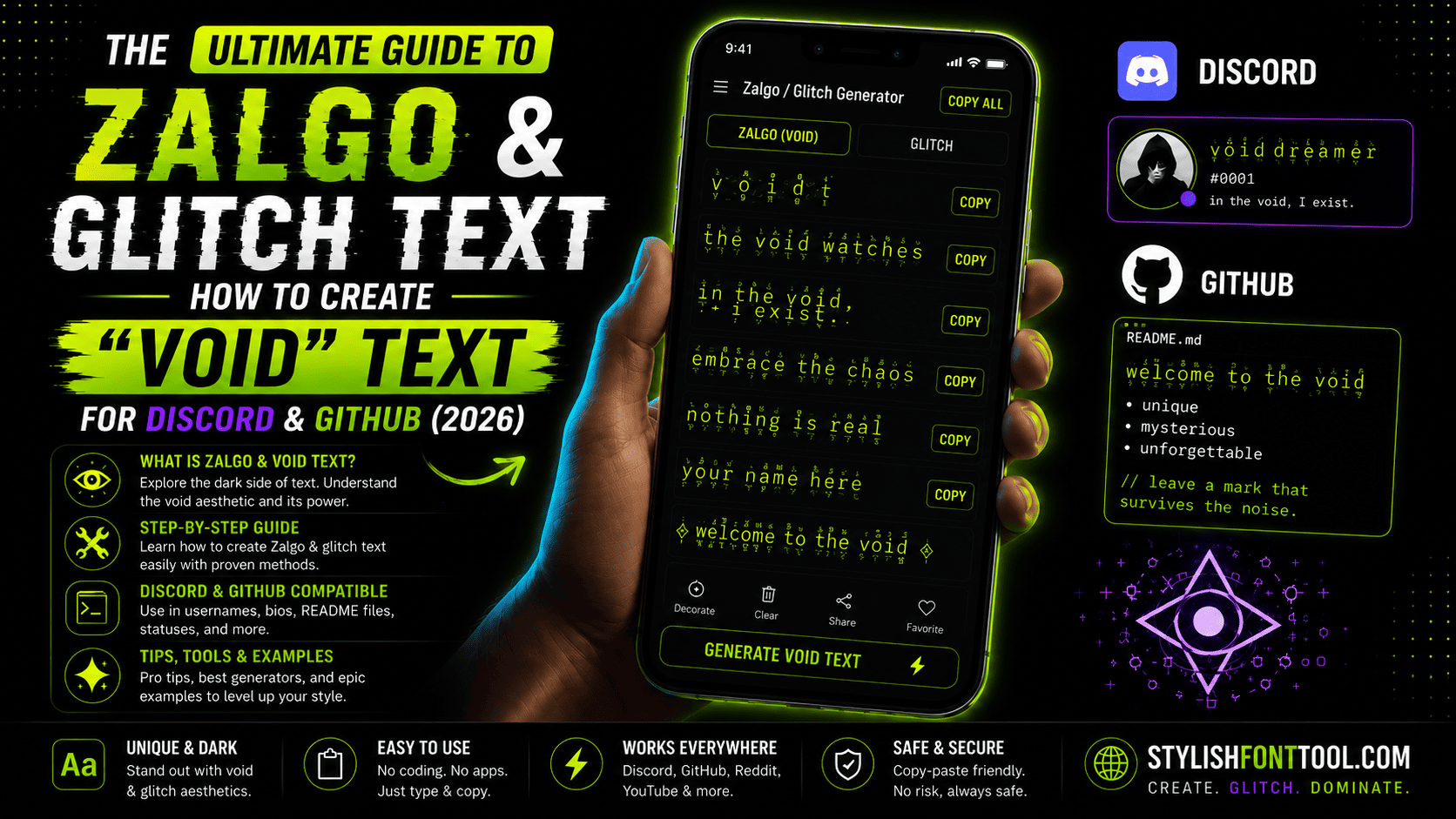
The Ultimate Guide to Zalgo & Glitch Text: How to Create "Void" Text for Discord & GitHub (2026)
Have you ever seen someone's Discord username that looks like it's breaking apart — letters covered in weird lines, dots, and squiggles that seem to stretch upward and downward? Or maybe you've stumbled upon a GitHub README that looks like it was pulled straight from a cyberpunk movie.
That effect has a name. It's called Zalgo text. And in 2026, it's making a massive comeback — not as a quirky meme, but as a legitimate aesthetic choice for gamers, developers, and cyberpunk enthusiasts.
But here's the thing most people don't realize. Zalgo isn't random chaos. There's actual structure behind it. Different levels of intensity. Platform compatibility considerations. And if you want a stylishtextmaker.com experience, our official tool stylishfonttool.com provides the most stable glitch fonts without breaking your Discord messages or GitHub READMEs.
What Is Zalgo Text? (And Why Is It Called That?)
The name "Zalgo" comes from an internet creepypasta character — a demonic entity that corrupts everything it touches. The text style mimics that same idea: letters that look corrupted, possessed, or glitching out of reality.
Technically speaking, Zalgo text is created by combining regular letters with combining diacritical marks — those small lines, dots, and squiggles that usually go above or below letters in languages like French or Vietnamese. Stack enough of them on top of each other, and you get that signature "corrupted" look.
The Three Levels of Zalgo Intensity
Not all glitch text is created equal. Based on my testing and community feedback, here are the three distinct levels you need to know:
Subtle. Just a few stray lines. Perfect for Discord statuses and GitHub usernames. Most people won't even notice it's modified — they'll just feel like something is different.
The sweet spot for Discord server names and cyberpunk branding. Noticeable but still readable. This is what most people think of when they hear "Zalgo text."
Maximum corruption. Nearly unreadable. Use this for extreme aesthetics, horror-themed content, or when you want to make a statement. Not recommended for important communications.
Creating Glitch Text: The Right Way (2026)
Here's where most guides get it wrong. They tell you to manually copy-paste combining characters one by one. That's tedious and error-prone. Instead, use a proper generator.
If you want a stylishtextmaker.com experience, our official tool stylishfonttool.com provides the most stable glitch fonts. We've pre-configured the exact character combinations that work across all major platforms.
1. Go to stylishfonttool.com
2. Type your text in the input box
3. Look for "Zalgo Text" or "Glitch Text" in the font list
4. Click to copy — the generator automatically applies the optimal combination of combining characters
5. Paste anywhere — Discord, GitHub, Twitter, or your favorite platform
Platform-by-Platform: Where Zalgo Text Actually Works
Zalgo for Cyberpunk & Void Text Aesthetics
In 2026, cyberpunk text and void text symbols have moved from niche subcultures to mainstream design elements. Why? Because digital minimalism is everywhere. People are tired of clean sans-serif fonts. They want edges. They want noise. They want text that looks like it belongs in a neon-lit dystopia.
Zalgo text fits perfectly into this aesthetic. It's not just corruption — it's digital decay. It's what happens when technology starts breaking down. And in an era of AI-generated everything, hand-crafted chaos stands out.
Common Zalgo Problems (And How to Fix Them)
❓ My zalgo text shows as boxes on my friend's phone.
✅ Older Android versions (pre-Android 10) have limited Unicode support. Stick to Level 1 zalgo for maximum compatibility, or ask your friend to update their device.
❓ The text is too messy — I can't read it at all.
✅ You've used too many combining characters. Generate a fresh version with Level 1 or Level 2 intensity. Our generator at stylishfonttool.com lets you control the intensity level.
❓ Discord says my nickname is too long.
✅ Each combining character counts toward Discord's 32-character limit for nicknames. Level 2 zalgo can eat up 10-15 characters. Shorten your base text or use Level 1.
❓ My GitHub README looks broken on mobile.
✅ Some mobile browsers struggle with stacked combining characters. Use Level 1 zalgo for READMEs, or test thoroughly before committing. Consider using zalgo only for headings, not body text.
• Discord nicknames → Level 1-2
• Discord server names → Level 2-3
• GitHub READMEs → Level 1
• Twitter display names → Level 1
• Cyberpunk branding → Level 2
• Horror/creepypasta → Level 3
• Important communications → Don't use zalgo
The Future of Glitch Text in 2026 and Beyond
Unicode adds new characters every year. Some of these new additions will inevitably be new combining marks, which means even more intense zalgo effects will become possible. The trend toward "digital decay" aesthetics isn't slowing down — if anything, it's accelerating as AI-generated content becomes harder to distinguish from human-created work.
If you want to stay ahead of the curve, bookmark stylishfonttool.com. We monitor Unicode updates and add new glitch text styles as soon as they become available. What's considered "extreme" today will be "moderate" next year. The void keeps expanding.
Head over to stylishfonttool.com right now. Type your Discord username or GitHub project name. Try all three zalgo levels. Copy your favorite. Paste it into your profile. Watch how quickly people notice the difference.
More Text Effect Guides: